The Grisaille

March 2013GEDSC DIGITAL CAMERA
Fine Art in Oil
A Newsletter For Artists – By Artists Volume 3
By Cassondra Foxpool

The Grisaille

     The classes I take at Relis Art Studio are held once a week for three hours.  That gives me a lot of time between classes to think.  I was thinking I needed to study up on and practice drawing.  I was thinking about the things Linda needed to correct me on, in the drawing phase of this project.

    I got a few books from the library on drawing.  I sketched at home every night.  That’s not the same as doodling.  You have to actually be able to identify what you draw when you are finished.  Over time, I could make better shapes and angles, and even a bit better circles.  I learned about perspective and vanishing points.  There is so much to learn about composition.  But for now, Linda was doing all the set-ups for us, so the importance of composition hadn’t entered my mind yet.

     If you are a true novice, as I was, you will find that outside, independent study is very helpful.  Nevertheless, the most important and long lasting instruction came from Linda.  Sometime I still find myself seeing one thing and drawing something else.  I might see a slanted line in some object and draw it in as a straight line.  When this happens, I can’t say if I was in a hurry or if my mind was just lost in space somewhere.  The mistake will make a difference in the project at some point and willneed corrected  but, I always wonder how I could have drawn a horizontal line when it is clearly diagonal.  So I’ll try to slow down and concentrate better.  Maybe this happens to everyone on occasion, but I mentally beat myself up when I do it myself.

     I entered class this time with a bit more confidence in my drawing skills, if not my painting skills.  Linda still had her work cut out for her as she shows us ways to understand how to replicate what we are viewing; ways to make it three dimensional.   I was looking at the folds on the draped cloth in the background and having difficulty transferring what I saw to my canvas.  I found out I wasn’t the only one with this problem.

     “O.K.” Linda said, “I see you’re all having trouble with the folds in the background.  Think of a wave.  It has a front leading edge, a trailing edge and the peak.  The fabric has three planes also- two sides and a top.”  She explained that the leading edge was the side nearest the light and usually was fairly well lit.   The trailing edge was behind the fold and was typically darker.  The top gets the most light and is the lightest value of the three sides.  “Use your value scale to determine the values of each side,” she reminded us.  I dutifully put in the three different values and …. it looked like a childish drawing of sunrays coming down my canvas.

     Linda told us how we need to blend the edges of any areas where two different values meet.  This is called softening the edge.  With the backdrop, she had to also explain about the direction the light flowed over the fold and that blending should be done in that rounded hilltop direction.   This requires a bit of practice to perfect.  I guess this is what distinguished it from work you see in a coloring book.  I find that the sable brushes work best for me in blending.  Do you have a favorite brush, make, size or shape brush for different tasks?  I’d love to hear your opinions on this.

     By the time we finished this painting, I was ready to get some color in my world.  Linda told us she painted, for an entire year, in grey values during her art education.  No wonder she is so good at it!

     As I explained in my last newsletter, doing an entire painting in values of grey is not only called monochromatic, but is more specifically, a grisaille. (pronounced griz eye’)  It took me several more weeks in class to complete this painting.  With all I learned over the course of those weeks, I definitely felt closer to being an artist.  But there was so much more to learn.

     At last I had another painting to show for my efforts.  I have to admit I was quite proud of it.  My husband felt it was worth the work …. and the wait.

Hurray!  We are going to use colors next time!

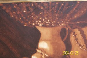
I mistakenly told you in my second news letter that there was a cup in this setup.  As you can see, that was my error. No cup.

Below is a photo of that painting.  It is titled

     Early Morning Grind

  159688338605

The date on this photo is not when I painted it.  It is when the photo was taken.

I later sold this painting in a raffle.

View Finder

http://foxpoolsartstudio.weebly Foxpool Online Studio

http://cfoxpool/2013/02/12/the-making-of-an-artist-2 Volumn 1 – Feb. 2013 (in case you missed my very first newsletter)

http://www.relisart.com – Linda Relis

NEWSLETTER VOLUMN 2

                                                                                                                                March 2013GEDSC DIGITAL CAMERA
Fine Art in Oil
A Newsletter For Artists – By Artists Volume 2
By Cassondra Foxpool

LEARNING OUR VALUES

      After completing a painting in our very first class I was really excited to see what I’d take home this week. All the other

newbies showed up again, too, so I guess that completed painting last week really sucked us all in. The instructor, Linda Relis,

said we would be using two colors of paint this time. True to her word, we used two colors – black and white.

I brought and painted on a smaller canvas board (8” X 12”) in this class as Linda had suggested. You can buy canvas on a stiff

cardboard backing rather that the stretched canvas on a frame, which we used last week. I thought we were just going for variety

in size as well as color and content. Linda had other ideas. We began by drawing ten rectangles all the way across along the 12”

side of the board. At that point I thought I had it figured out that we were painting a piano keyboard.
But no, Linda said we were going to make a value chart. This is a tool we would use throughout our painting years. I knew a

few definitions of value, but they had nothing to do with painting.  I found that what I had always called various shades of a color

were, in fact, various values of a color. I was interested to see just where Linda was going with this. As Linda held up an example

of  a value chart for us to see, I was thinking, ‘This isn’t going to be the masterpiece I had envisioned taking home and showing to

my husband today.’

     We squeezed little puddles of black and white paint from the tubes onto our palettes. We numbered our rectangles one

through ten, left to right. We painted the number one rectangle black and the number ten rectangle white. All the boxes in

different shades ( I mean values) of grey in between. This wasn’t as easy as it sounds because we couldn’t just paint whatever color

felt right to us. There had to be a subtle one-step change from one box to the next, not too much and not too little. Linda was the

judge of that and  guides us on our way.  I had no idea, at that time  just how necessary and helpful this value (and valuable) chart

would become.  Think how boring this  world would be if everything had the same intensity of color.

1-Value Scale          Value Scale

1     2       3          4        5         6        7       8       9       10

When we finished the value chart,  Linda put a spotlight on a setup she wanted us to paint.  Again with a cloth backdrop, she

had placed a white thermal carafe on the right side of a small table with a cup in the center, then an antique coffee grinder on the

left side. The backdrop covered not only the back, but ran across the table and dropped down in front of the table. I’m telling you

all this because, geeze,  it seemed a bit too much for where I felt my ability level stood.

“Now, using your value chart for reference, I want you to paint what I have arranged. Just paint it in black and white. It will

be monochromatic, which means you will use only one color, and modify it only by adding black or white.” I could not believe my

ears! Linda spoke with such confidence, as if we would all just pick up our brushes and get to work. In fact, we all just kind of

looked at her and glanced at each other, our wide eyes screaming our surprise and self-doubt.  Um, this is only lesson TWO.

What did I miss?  How did we jump from a one color Chiaroscuro to a full- fledged still-life?  I looked toward the more

advanced students. They were watching us, smiling and giving us curt little nods as if to assure us that, yes indeed,  one way or

another, we would paint that scene.

Linda explained that, to be more precise, we would be painting a grisaille, (pronounced griz-eye’).  This is a monochromatic

painting that is done in all shades of grey,  (as opposed to shades of another color).

Out came a new stretched canvas, pencils and a new kneaded eraser. This is a good time to tell you that this eraser is

different than the ones I’d used in school. Light grey in color when new, it is soft and malleable. It erases by picking up the

graphite, or lead, when you want to make a correction.  As time goes on you will notice the eraser getting darker and darker grey.

Just keep kneading it to find a cleaner spot. Eventually, of course, it will get so dirty that it will need replaced. These erasers last

a long time and don’t leave crumbs or erasure residue behind.
It was about this time that Linda introduced us to the viewfinder. The viewfinder is simply a small piece of stiff paper or

cardboard with a rectangle cut out of the center.  Linda gave each of us one and said,  “To use it, hold it up at eye level between

yourself and your subject. View through the hole like you would a camera lens, and adjust it left or right, up or down and closer

or further away from your face until you find the view of your subject you would like to paint.” This is about the most non-

technical artists’ tool you can get, but it works!

Of course, we had to draw the setup on our canvas before we could start painting.  So I looked at the setup through my

viewfinder and found the view I liked.  Now Linda wanted us to use a light hand in drawing in basic shapes on our canvas just to

see if it all fits the way we want it to. I had my brand new eraser, so I wasn’t intimidated by the drawing part. But wait! Not so

fast.

“Look carefully at the setup.” Linda said. “Look not only for the shapes of the objects, but also the shapes of any shadows

thrown by the light. I want you to draw in the shadows, too.”  OK,  so000 this wasn’t going to be difficult enough. We now

needed  to draw shadows, too.  She pointed out that the backdrop had folds as well as shadows, and yes, we were to draw those in

also.

After a few minutes Linda stopped us. “These objects can’t be floating in space. You have to determine where the back of the

table is going to be and where the front of the table is going to be. Then you will have a better idea where to put the individual

objects on the top of the table.   And see how the fabric drapes down over the front edge of the table?  You’ll want to be sure to

indicate that in your drawing.”

I have to admit, I felt inadequate, unsure, afraid I was going to make a fool of myself now.  But I stopped myself from that line of

thinking, took a deep breath and became determined to give it my best shot.  I had to trust Linda to lead me through it.

For the remainder of that class, we diligently worked on drawing the setup…and the shadows. My eraser got a workout. I

wasn’t completely satisfied with my drawing when I left that day, but I could see that something was forming that could be

worked into a reasonable facsimile of the setup. Next week, when I came in fresh and rested, I just knew that with Linda’s

guidance I would whip that drawing into shape.

Come back and see how it turned out.

 1-View Finder

View Finder

http://foxpoolsartstudio.weebly Foxpool  Online Studio

http://cfoxpool/2013/02/12/the-making-of-an-artist-2     Volumn 1 – Feb. 2013 (in case you missed my very first newsletter)

http://www.relisart.com – Linda Relis

The Making Of An Artist

                                                                                  A Newsletter By Artists-For Artists                        Volumn 1

By Cassondra Foxpool-

Foxpoolsartstudio.weebly.com

This is my first newsletter, so I will tell you a bit about myself. My name is Cassondra Foxpool. I live in Port St. Lucie, Florida and I spend my summers in Iowa, where my children, grandchildren and great-grandchildren live. I am an artist. I wasn’t always an artist, nor had I dreamed all my life of becoming an artist. I didn’t go to a fancy art school or college to learn how to paint. I’ve had various careers in my lifetime; none of them as an artist. This is how it happened.

One day there was an interview in our local newspaper about Linda Relis, an accomplished artist. (Someday I will interview her for my newsletter and she can share her insight with us.) Linda had all the formal training that I lacked. Reading that she taught classes locally, I thought, ‘Why not?’

I called Linda to get the particulars and found out she taught fine art-oil painting. Always a risktaker, I signed up. I wasn’t sure if I had the talent to paint, or the patience, or the creativity or the drive. I just thought it sounded interesting, would be fun to try and would fill the extra time I found since retiring.

Oh, it was such fun shopping for the supplies on the list Linda had given me! Michael’s and Hobby Lobby became my favorite stores, and they both offered coupons of 40% – 50% off. I made certain that the higher priced items were purchased with these coupons.

When my husband saw the results of my shopping, he asked, “Do you really need all that?”

I have to admit that I bought more than was on the supply list. Unable to decide which type of brush to buy, I bought ten of them. Do you know there are quite a number of pallet types out there? Oh, and so many beautiful colors of paint. I bought new pencils and erasers even though there were some at home. And I just couldn’t stop myself from buying six canvases. Yes, I could definitely have gotten by with a lot less.

“Boy, you’d better create a real masterpiece with all that stuff,” he teased.

The night before class I began to get a little nervous. I felt a bit of pressure to make the investment worthwhile and produce, if not a masterpiece, at least an acceptable painting. Mostly, the pressure came from myself. Being competitive and driving myself to see challenges to the end, I don’t like to lose. I knew that I couldn’t even draw a good circle without a canning-jar lid to trace around. Maybe we would be painting pre-printed pictures like in a coloring book?
When I got to Linda’s art studio, it was a relief to see that I was not the only novice attending. There were two other new students that day. Seeing a few ‘seasoned’ students there, and the level of work they were doing was very encouraging.
“You’ll only be using one color of paint today, and one brush and some rags. And by the time this three-hour class is over, you will have a completed painting to take home with you.” Linda told us. I thought she sure had a lot of confidence in someone who can’t draw a good circle.
That day we painted a chiaroscuro, which literally means the placement of light and shade in a picture. I was afraid to make the first mark on the canvas. What if I did it wrong and messed it up? Well, it may be a difficult word to pronounce, but with Linda’s guidance we all completed our chiaroscuro painting that day.
I couldn’t wait to get home and show off my creation! I was so proud of it! Would my husband see the beauty in all that burnt umber? I shouldn’t have given it another thought. He loved it! He asked if I really did it or if the teacher did it? (He’s seen my circles.) When I showed my friends they said I was a natural. (I have really good friends.) At my age, I didn’t know I still had days ahead when I would be celebrating new accomplishments.
I felt proud of the accomplishment, but Linda had told us that we would be using two colors next week. Now I wondered what she had in store for us. If I could do it…you can do it.

Stay tuned.

Enter your email address:

Delivered by FeedBurner

Students in Linda’s classes (myself included) currently have an exhibition at:

The Artist Nest Gallery

6550 S. Federal Highway

Port St. Lucie, Fl.

for the entire month of February, 2013.
Call 772-882-4344 for gallery hours

 My First Oil Painting

My First Oil Painting

This is my chiaroscuro.
When I sold that painting, my husband really didn’t want me to sell it. I told him not to worry, I could paint another one in three hours.